With summer only one month away, construction projects are starting to pick up and begin! Even if you’re not a construction worker, there are many areas and potential hazards to be aware of if you’re in the vicinity of a job site. There are many signs and barricades located around sites that prevent the public from accessing the area under construction, but what do these signs mean? Typically, hazard signs don’t have words, but icons that depict potential dangers to warn those nearby. However, depending the on the worksite, different signs may be present depending on the requirements.
No matter where you work, you’ve heard of OSHA, short for the Occupational Safety and Health Administration. Skyscraper construction was becoming extremely popular in the 30’s, with the Empire State Building being one of the projects many Americans reminisce about. Surprisingly, yet unfortunately, 5 men died due to falls or being struck by equipment/materials during construction. OSHA was created in 1970 by President Nixon to reduce the number of workplace fatalities, injuries, and illnesses, which was proven extremely successful as workplace safety has decreased by almost 63% since its creation. In 1976, another safety giant, American National Standards Institute (ANSI) joined OSHA in continuing safety improvements in the workplace. This joint coordinating committee led to the successful creation of the U.S. Consumer Product Safety Commission (CPSC) in 1982 which focuses on consumer products. Before their joining, OSHA had their own design standard for signs with three classifications – danger, caution, and safety instruction. However, ANSI wanted to improve their instruction to viewers about not only potential dangers, but how to handle certain situations.

In 1968, ANSI had two more classifications- directional and informational signs. They also organized the 5 classifications by color, design, wording, lettering, and current construction. More recently, in 2017, their sign standards and classifications were further revised, and now includes 8 – danger, warning, caution, notice, general safety, fire safety, directional arrow signs, and special signs. The revision also defines the sign sizes, text sizes, and viewing distances. This is the current standard that OSHA refers to. The standard for the signs requires 3 components – Signal Word(s), Safety Symbol(s), and a Sign Legend.
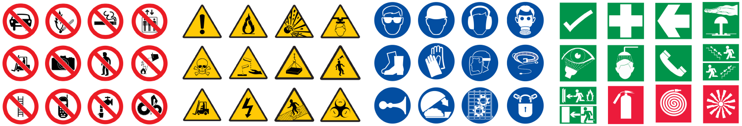
The safety word is placed at the top of the sign to identify what category of hazard is near. The 4 safety words correspond to the classifications written as DANGER, WARNING, CAUTION, and NOTICE. If more than one hazard is present, only one signal word can be used as long as the information on the sign addresses each hazard and the signal word expresses the hazard of greatest danger. With the signal words, are also corresponding colors – red background with white lettering, orange background with black lettering, yellow background with black lettering, and blue background with white lettering, respectively. Safety instruction signs do not come with signal words as they are demonstrating the necessary action to achieve safety during an emergency. These include arrows pointing in required directions, identifying fire extinguishers, and fire hose locations.

The safety symbol, or pictograms, are used to help people visualize what the hazard could result in. These images are extremely helpful with language barriers. There are 4 main types of symbols – hazard alert, mandatory action, prohibition, and informational. Hazard alerts are seen as either a yellow equilateral triangle with black icons, or just the black icon. Prohibition symbols are seen with a black icon crossed out with a red backward slash and a red circle surrounding. Prohibition symbols are MANDATORY for use on ISO compliant product safety labels. Mandatory symbols are also seen as black icons, or a white symbol encased in a black or blue circle. The blue circle and white icon are required on ISO compliant product safety labels that contain mandatory action symbols. Information symbols include safety related icons pertaining to fire or emergency equipment. Fire related safety symbols are either red icons or white icons encased in a red square, and emergency equipment symbols are green icons or white icons encased in a green square.
The sign legend, or understood to be the format of the sign, must accurately describe the hazard or procedure taking place to alert those nearby. The signal word must be placed at the top of the sign extending the full length, safety symbols aligned vertically on the left, with the text describing the hazard on the remaining space to the right. This text must include the hazard type, the consequence of not avoiding the hazard, and how to avoid it all together. ANSI also recommends that direct statements are used to eliminate the possibility of misunderstanding what is being asked and illustrated.

While there are many things to look out for, you shouldn’t be near a construction site anyways. However, if you are, and see these signs, make sure to be aware of your surroundings, as there could be unnoticeable hazards nearby. If you’re unsure of what a sign means, it’s generally best to just turn around and walk away rather than try and find someone to ask, only to find out what the hazard was in an unfortunate way. If you enjoyed this blog, please make sure to share it on social media by clicking the icons below! Also, please leave a comment with any comments, questions, or ideas for future blog posts!
Share this Post